
More Than a Mark: The Story Behind the Studio Donato Logo
A logo is often the first introduction to a studio. For us, it is also a reflection of how we think about architecture. While simple in appearance, the Studio Donato logo is composed of several elements that represent the balance between structure and creativity that defines our work. Together, these elements tell the story of Studio Donato.
A studio that values creativity but understands the importance of discipline. A belief that the best architecture emerges from the balance between constraints and possibilities. Just as every project begins with understanding the parameters of a site before exploring opportunities within it, our logo reflects the same approach. It is a simple mark, but one that guides our work every day: clarity, craft, creativity, and thoughtful design.


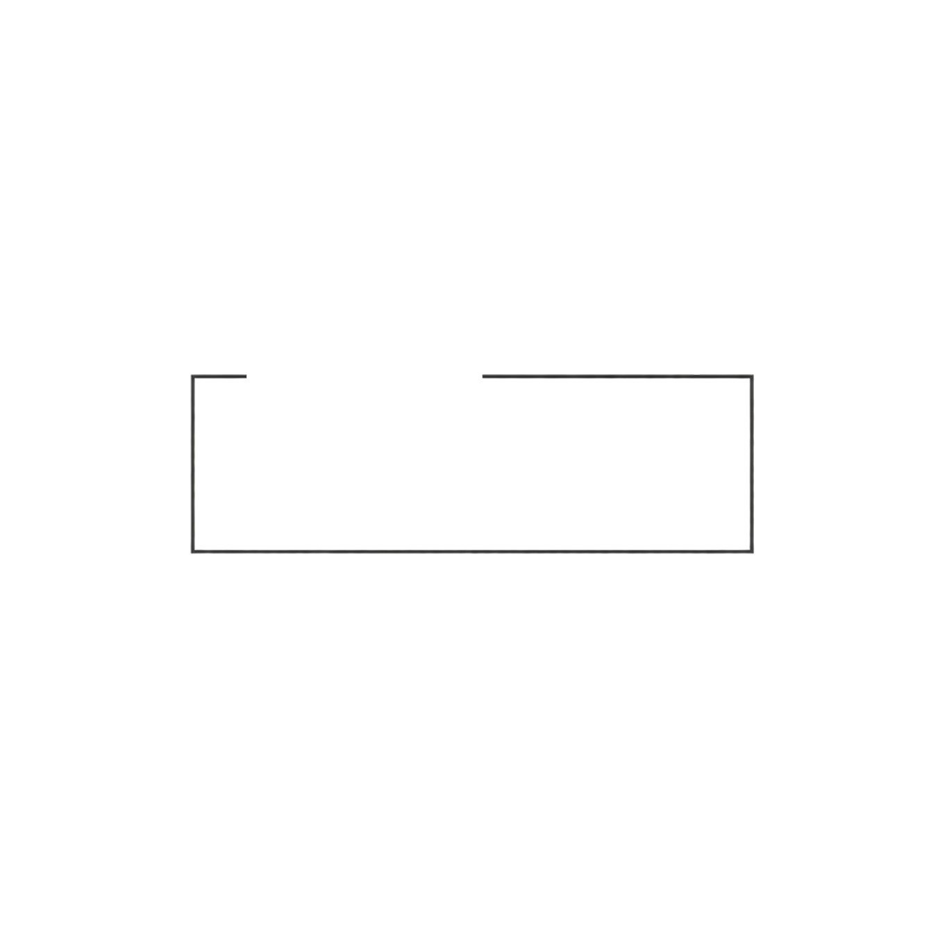
The Box
The first element is the square outline.
The box represents order, discipline, and the framework within which architecture is created. Every project is shaped by a set of parameters: site conditions, zoning requirements, building codes, budgets, schedules, and construction realities.
These constraints are not obstacles. They provide structure and create the foundation upon which good design is built.
The box represents the known.

Donato
Within the box sits the name Donato.
This element reflects the technical side of our practice. The drawings, details, specifications, building science, and countless decisions that transform an idea into a buildable project.
Architecture requires creativity, but it also requires rigor. Every line drawn carries responsibility.
The placement of the name within the box acknowledges that good design must operate within the realities of construction while maintaining clarity and purpose.

Studio
The word Studio extends beyond the boundaries of the box.
This move is intentional.
While architecture requires discipline, it also requires exploration. The studio is where ideas are tested, challenged, and refined. It is where creativity begins to push beyond what is expected.
By extending beyond the frame, the word Studio represents curiosity, imagination, and the willingness to think beyond convention while remaining grounded in the realities of practice.
The studio exists both inside and outside the box.

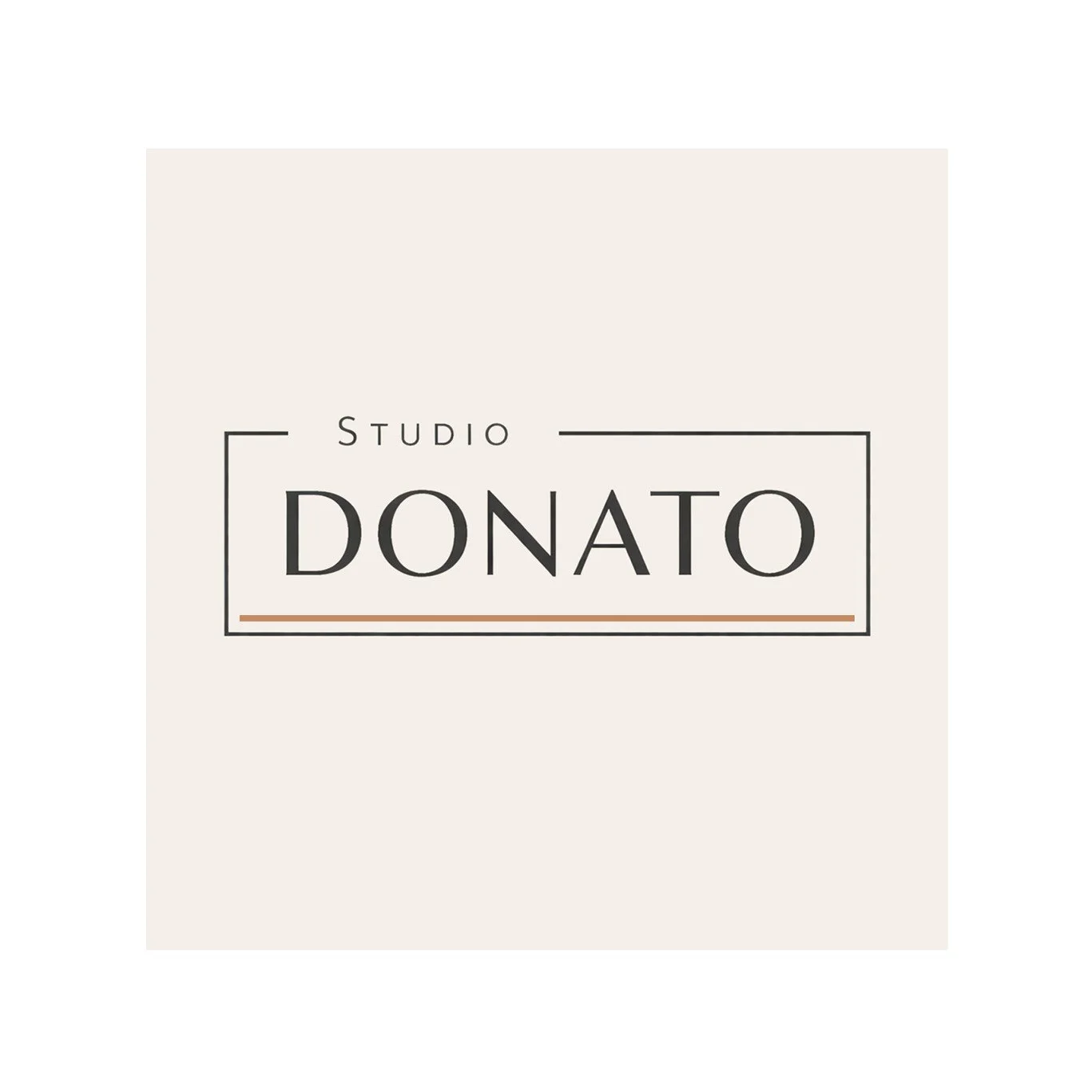
The Accent
The final element is the terracotta line and cream background.
For us, this small gesture carries significant meaning.
It introduces warmth, materiality, and a human touch to an otherwise restrained composition. It serves as a reminder that architecture is ultimately about people and place.
The color draws inspiration from earth, clay, brick, sand, and natural materials. It reflects our appreciation for craftsmanship, permanence, and the physical act of building.
While the box represents order and the typography represents process, the accent introduces character. It is the element that gives the mark a sense of life.